# Ellipse Annotations
Ellipse annotations are used to draw circles on the chart area. This can be useful for highlighting different areas of a chart.
# Configuration
# Ellipse annotation specific options
The following options are available for ellipse annotations.
| Name | Type | Scriptable | Default |
|---|---|---|---|
backgroundShadowColor | Color | Yes | 'transparent' |
borderWidth | number | Yes | 1 |
label | object | Yes | |
rotation | number | Yes | 0 |
# Common options to all annotations
The following options are available for all annotations.
| Name | Type | Scriptable | Default |
|---|---|---|---|
adjustScaleRange | boolean | Yes | true |
backgroundColor | Color | Yes | options.color |
borderColor | Color | Yes | options.color |
borderDash | number[] | Yes | [] |
borderDashOffset | number | Yes | 0 |
borderShadowColor | Color | Yes | 'transparent' |
display | boolean | Yes | true |
drawTime | string | Yes | 'afterDatasetsDraw' |
init | boolean | See initial animation | undefined |
id | string | No | undefined |
shadowBlur | number | Yes | 0 |
shadowOffsetX | number | Yes | 0 |
shadowOffsetY | number | Yes | 0 |
xMax | number | string | Yes | undefined |
xMin | number | string | Yes | undefined |
xScaleID | string | Yes | undefined |
yMin | number | string | Yes | undefined |
yMax | number | string | Yes | undefined |
yScaleID | string | Yes | undefined |
z | number | Yes | 0 |
# General
If one of the axes does not match an axis in the chart, the ellipse will take the entire chart dimension. The 4 coordinates, xMin, xMax, yMin, yMax are optional. If not specified, the ellipse is expanded out to the edges in the respective direction.
| Name | Description |
|---|---|
adjustScaleRange | Should the scale range be adjusted if this annotation is out of range. |
display | Whether or not this annotation is visible. |
drawTime | See drawTime. |
id | Identifies a unique id for the annotation and it will be stored in the element context. When the annotations are defined by an object, the id is automatically set using the key used to store the annotations in the object. When the annotations are configured by an array, the id, passed by this option in the annotation, will be used. |
rotation | Rotation of the ellipse in degrees, default is 0. |
xMax | Right edge of the ellipse in units along the x axis. |
xMin | Left edge of the ellipse in units along the x axis. |
xScaleID | ID of the X scale to bind onto. If missing, the plugin will try to use the scale of the chart, configured as 'x' axis. If more than one scale has been defined in the chart as 'x' axis, the option is mandatory to select the right scale. |
yMax | Bottom edge of the ellipse in units along the y axis. |
yMin | Top edge of the ellipse in units along the y axis. |
yScaleID | ID of the Y scale to bind onto. If missing, the plugin will try to use the scale of the chart, configured as 'y' axis. If more than one scale has been defined in the chart as 'y' axis, the option is mandatory to select the right scale. |
z | The z property determines the drawing stack level of the ellipse annotation element. All visible elements will be drawn in ascending order of z option, with the same drawTime option. |
# Styling
| Name | Description |
|---|---|
backgroundColor | Fill color. |
backgroundShadowColor | The color of shadow. See MDN (opens new window). |
borderColor | Stroke color. |
borderDash | Length and spacing of dashes. See MDN (opens new window). |
borderDashOffset | Offset for line dashes. See MDN (opens new window). |
borderShadowColor | The color of the border shadow. See MDN (opens new window). |
borderWidth | Stroke width. |
shadowBlur | The amount of blur applied to shadow. See MDN (opens new window). |
shadowOffsetX | The distance that shadow will be offset horizontally. See MDN (opens new window). |
shadowOffsetY | The distance that shadow will be offset vertically. See MDN (opens new window). |
# Label
Namespace: options.annotations[annotationID].label, it defines options for the the label of annotation.
All of these options can be Scriptable
| Name | Type | Default | Notes |
|---|---|---|---|
color | Color|Color[] | 'black' | Text color. |
content | string|string[]|Image (opens new window)|HTMLCanvasElement (opens new window) | null | The content to show in the label. |
display | boolean | false | Whether or not the label is shown. |
drawTime | string | options.drawTime | See drawTime. Defaults to the annotation draw time if unset |
font | Font|Font[] | { weight: 'bold' } | Label font |
height | number|string | undefined | Overrides the height of the image or canvas element. Could be set in pixel by a number, or in percentage of current height of image or canvas element by a string. If undefined, uses the height of the image or canvas element. It is used only when the content is an image or canvas element. |
opacity | number | undefined | Overrides the opacity of the image or canvas element. Could be set a number in the range 0.0 to 1.0, inclusive. If undefined, uses the opacity of the image or canvas element. It is used only when the content is an image or canvas element. |
padding | Padding | 6 | The padding to add around the text label. |
position | string|{x: string, y: string} | 'center' | Anchor position of label in the annotation. |
rotation | number | undefined | Rotation of label, in degrees. If undefined, the annotation rotation is used. |
textAlign | string | 'start' | Text alignment of label content when there's more than one line. Possible options are: 'left', 'start', 'center', 'end', 'right'. |
textStrokeColor | Color | undefined | The color of the stroke around the text. |
textStrokeWidth | number | 0 | Stroke width around the text. |
width | number|string | undefined | Overrides the width of the image or canvas element. Could be set in pixel by a number, or in percentage of current width of image or canvas element by a string. If undefined, uses the width of the image or canvas element. It is used only when the content is an image or canvas element. |
xAdjust | number | 0 | Adjustment along x-axis (left-right) of label relative to computed position. Negative values move the label left, positive right. |
yAdjust | number | 0 | Adjustment along y-axis (top-bottom) of label relative to computed position. Negative values move the label up, positive down. |
z | number | 0 | It determines the drawing stack level of the label element, with same drawTime. |
# Position
A position can be set in 2 different values types:
'start','center','end'which are defining where the label will be located- a
string, in percentage format'number%', is representing the percentage on the size where the label will be located
If this value is a string (possible options are 'start', 'center', 'end' or a string in percentage format), it is applied to vertical and horizontal position in the annotation.
If this value is an object, the x property defines the horizontal alignment in the annotation. Similarly, the y property defines the vertical alignment in the annotation. Possible options for both properties are 'start', 'center', 'end', a string in percentage format. Omitted property have value of the default, 'center'.
# Fonts and colors
When the label to draw has multiple lines, you can use different font and color for each line of the label. This is enabled configuring an array of fonts or colors for those options. When the lines are more than the configured fonts of colors, the last configuration of those options is used for all remaining lines.
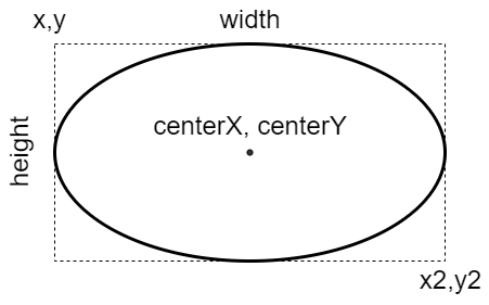
# Element
The following diagram is showing the element properties about a 'ellipse' annotation: